
 Yahoo奇摩新聞
 丹尼爾·布倫—在「思映之間」的美學
Banqiao Y15 MRT Station is the Jewel of the new Circular Line.
【看英文中國郵報學英文】丹尼爾·布倫「Daniel Buren」以其打破常規、具永久展示性的場造藝術(in situ)在藝術史上留下一席之地,他的作品表現出藝術的另一視角—聚焦在藝術創作的過程以作為作品表徵對藝術自主性之漠視的反叛。
Daniel Buren is a figure to go down in art history for his unconventional in situ permanent displays that present art in a way highlighting the creative process as opposed to the representation of pieces that disregard autonomous art.
這位來自法國的概念藝術家創造了 「in situ」這個新詞來傳達其作品與周圍環境的連結。他反對傳統呈現藝術的形式,因此在他的作品中少有可移位或能脫離環境脈絡的。他的作品多可歸類為裝置藝術,因為裝置藝術的理念與他對創作的信念最相符。
The French conceptual artist has coined the term “in situ” for the connection between his work and where it takes place. He disapproved traditional ways of presenting art, thus making it rare to find his pieces that are mobile and lacking context. His choice often falls under installation art as this concept aligns best with his own creative beliefs.
來自觀者的反思與互動 | A Reflection and Interaction from the Viewers
與大家的期待相反,這位藝術家認為攝影無法捕捉藝術的本質,而只是以「紀念品」的模樣呈現原初的作品。他的作品則將概念融入公共場域,這個過程確保它將永遠是一場充滿生命力、豐富且真誠的實踐。
Contrary to all expectations, the artist believes that photographs do not capture the actual essence of art, rather only represent “souvenirs” of the initial piece. The process by which he takes his conceptual work and merges it into the public realm will always be a vital, affluential and bona fide practice.
Buren有許多著名的作品,包括在1986年初展時便引起爭議「兩個平台」(Les deux plateau)。這座3000平方公尺的雕像矗立於巴黎皇家宮殿花園之中,挑戰歷史遺跡是否可以作為畫家揮灑創作之素材的倫理問題,在當時掀起熱議。
He is renowned for pieces such as “Les deux plateau” which sparked controversy in 1986 when it was first put on display. The 3,000 square meter sculpture in the courtyard of the Royal Palace in Paris made the public question the ethics behind using historical sites as a canvas for artists.
他於2016年五月至2017年四月為路易威登(Louis Vuitton)創作並展出的裝置藝術 「Observatory of Light」 由12片玻璃「船帆」作為外殼,使用3600片玻璃濾色片等距排列,包含他最具標誌性的白條紋在內13種不同色彩相映成趣,交織成獨特鮮明的燈光效果,將觀眾包圍在其中。
An installation for Louis Vuitton in France named “Observatory of Light” was made and displayed from May 2016 to April 2017. It contained 12 “sails” of glass shards that created unique vibrant amalgamations of light that enveloped viewers. Buren utilized 3,600 pieces of glass that were positioned equidistance from each other and varied in 13 different colors which accompanied his signature white stripes.

Buren令人屏息的公共藝術已經為許多國家的市容增添光彩,而他在英國的首座永久性裝置藝術也於2017年完成了。名為「Diamonds and Circles」,在新翻修的托登罕公路地鐵站(Tottenham Court Road station)內,風格強烈的幾何圖案嵌於蓋好的玻璃牆之間,鮮活的菱形與圓形搭上Buren的經典黑白條紋交疊出層次感,讓數百萬的通勤市民沐浴在品味不凡的當代藝術之中。
Buren’s breathtaking public artworks have adorned several countries all the same, he finished his first permanent public commission in the United Kingdom. “Diamonds and Circles” revamps Tottenham Court Road station and is fixed within the prebuilt glass walls. It layers vibrant diamonds and circles with Buren’s signature stripes of white alternating with black. This project offers millions of Tube users a taste of high-end, fantastic contemporary art.
諸如此類的場造(In situ)藝術與它所躍進的場域是依存的,它將一個場地所涵蓋的特色納入分析與考慮,以激發出靈感使此空間之轉化與再生得以可能。通常會被納入考慮的場域特徵有建築、入口、出口、窗戶、走道以及房間格局。
In situ works such as this one exist parallel to the site that were prompted in. Specific features of the site are analyzed and considered, these inspire and allow a transformation of the space. Features of a site that are considered are the architecture, entrances, exits, windows, corridors and layout of rooms.
其他納入考量的面向則形上且重要的多,例如在社會與團體中蘊含之政治、社會與經濟實力。由於他的創作考量各種因素,因此無庸置疑的每個作品之於其所處在的場域都是獨特且富含意義的。
Other aspects of the space that are considered are far more metaphysical and significant, things like political, social and economic forces within the society or community. Since his work considers various factors, there is no doubt that they are each unique and meaningful to the site in which they exist.

基於這些原因,Buren的創作致力於描繪出平凡事物的場景與樣態,拒絕使藝術成為菁英的娛樂品。他的藝術為鼓勵觀者反思和互動而存在。
For these reasons, Buren’s work represents the scenarios of mundane existence and refuses the ideal that art is for the elite’s entertainment. His art exists to encourage reflection and interaction from the viewers.

在托登罕公路地鐵站首次亮相的「Diamonds and Circles」,其概念於2008年就被提出了。當時Buren獲邀在車站展出自己作品,他的任務成為將整個車站翻新為倫敦的核心交匯樞紐之計畫的一部分。
“Diamonds and Circles” premiere at Tottenham Court Road station was conceptualized in 2008, when Buren was offered the chance to showcase his art. His commission was part of a scheme to reconstruct the station as a key interchange port in London. He completed this project in 2017.
在Buren最新的作品中,他指出運用公共領域對他而言是一件令人興奮的事,並且這麼做能逐漸改變一個區域對行人的影響。「這些事物之間的連結…美術館只吸引到一部分的人,然而地鐵站是公共的,總是有人來來去去。我希望能用美為他們的精神充電」。
Buren has stated on his most recent work that utilizing public areas for him is thrilling and it morphs the area’s impact on passerby “connections between all of these things… Museums attract only a portion of the population. The public in the Tube station is everyone, and there is a constant flux of people running both ways. I want to offer them a beautiful bubble of oxygen for the spirit.”
Buren特別強調,車站的每個出入口設計都被他賦予了「獨特的個性」。他指出,為了使整個建築與眾不同,「自然」要這麼做。在另一個訪問中,Buren論即他的作品為每日出入地鐵站的民眾帶來的影響,並點出列車與旅客洶湧急促的脈動巧妙的與一旁藝術的沈靜與活力形成對照。
Each entrance and exit of the station were given “distinct identities” and this was particularly emphasized by Buren. He stated that it was “natural” to do so and make the entire structure unique. During another interview, Buren discussed the impact that his piece had on the daily users of the Metro and he emphasized the furious movement of travelers and the trains juxtaposed the stillness and vibrancy of the art.
這項裝置藝術的創作目的在於使人停下來調整生活的步伐,並思考其中的象徵意涵。令Buren著迷不已的除了靜止與動態間的反差,還有地鐵的概念—在瞬息的變動中人群消失又顯現。
The purpose of the installation was to make people stop and pace their lives and consider its symbolism. Buren finds it fascinating that there is contrast between motion and speed, the concept of underground where people disappear and emerge while there is rapid movement.
這項創作將鮮活非凡的藝術世界帶入大眾平凡的日常通勤中。當最後一個高達2.4公尺的櫥窗完成之時,這件裝置藝術也宣告大功告成。它乘載著與此裝置藝術一致的裝飾圖案與象徵符號。Buren在托登罕公路地鐵站創作的裝置藝術巧妙的與原先由藝術家Eduardo Paolozzi為此地鐵站設計的玻璃馬賽克藝術結合在一起,該創作於1984年首次展出。
The piece brings the vivid and extraordinary world of art into the average daily commutes of the public. The installation was completed when the final cabinet topping off at 2.4 meters. It contained similar motifs and symbols as the rest of the installation. His work on Tottenham Court road station joins previous glass mosaics made by Eduardo Paolozzi which made their debut in 1984.
條紋是Buren的美學標誌,他甚至有「條紋先生」的綽號。條紋的簡約感和反覆性特徵使它成為Buren作品中永恆的核心符號。8.7公分等寬的條紋、由白色與其他顏色交替構成雙色相間圖樣,這些表達形式在他的作品中始終保持一致。
Stripes are Buren’s signature and he is colloquially known as “The Stripe Guy”. They remain a key feature of his works because of their simplistic and repetitive pattern. Each stripe is the equidistance apart at 8.7cm per stripe and alternate between white and another color, this remains constant in all his pieces.
條紋象徵除了致敬了他的法國身分以外,也以盤踞空間、空間之內的表現而非空間本身為主題進行深刻的描繪。條紋這個簡單的符號可說是他激進之藝術創見凝結成的心血結晶,透過他對「視覺工具」的運用而成就條紋的獨特性,並將藝術以超越傳統與常規的形式呈現。
Its significance pays homage to his French ethnicity but also portrays the theme of occupying space and expression within space rather than space itself. The stripes are a radical oeuvre which are set apart by his use of “seeing tool” through which art is represented outside of its traditional norms and rules.

「思映之間」在環狀線板橋站遇見大師美學 | ‘In Between Reflections’ at Banqiao Station
Buren於2002年完成的作品「無題」則較少人知曉,它以台灣當地高中為素材在外部進行裝飾。大多數人並不知道,Buren其實到訪過台灣幾次,而最近他透露了他在板橋捷運站的另一件場造藝術品。
Less know to the general public, “Sans Titre,” completed in 2002, decorates the outside of a Taiwanese local high school. Most people don’t know, Buren has made several visits to Taiwan where he recently unveiled another in situ piece at the Banqiao MRT station.
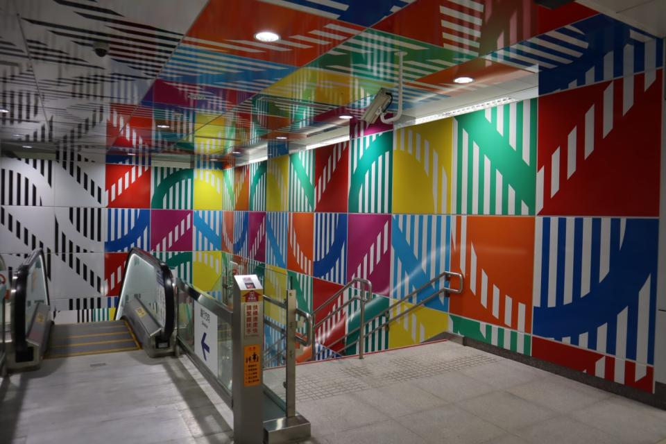
新北捷運環狀線第一區於2019年12月開始正式營運,位於全線中心的板橋Y15站,外觀設計以條紋和LED燈為主,色彩鮮豔活潑。車站大方展示著Buren的招牌條紋圖樣,八種顏色的條紋填滿月台與站內的部分天花板,繽紛的色彩由車站下的墩柱一路延伸到車站北側。
The first section of the new MRT Circular Line started operations in December 2019 with Banqiao Y15 Station sitting at its heart with its colorful design made of stripes and LED lights. The station boasts the artist’s iconic stripe pattern in eight different colors that are used through the platforms and some of the ceilings of the metro station, the pillars under the station and its north facade.
兩道長74.3公尺、寬2公尺的長條狀LED彩虹燈帶懸掛在候車月台的天花板上,分別由427條兩公尺長、87釐米寬的彩色條狀燈管組成,白光從燈管間等距的87毫米空隙中照出,提供充足的照明。全站共計使用了854條LED燈管。
To begin, two LED lights are suspended from the ceiling of the station above the embarkation areas. Their dimension is 74.3 meters long and 2 meters wide. They are each made up of 427 strips of length 2 meters and 87 millimeters wide spaced from each other by a vacuum of 87 millimeters. That’s a total of 854 LED strips.
所有的條狀燈管皆裝配在其背面的框架上使燈管線路能接上天花板。LED燈管多重的色彩在結合DMX燈光控制系統下能配合列車進出變換出多樣的燈光效果,帶給民眾一場光影的視覺饗宴。最初對於光影變化的場景構想是如此:兩個橫貫月台的LED彩虹燈帶每個小時固定亮起,連續八小時,一天三次。
All the strips are assembled on a rear frame that allows their attachment to the ceiling and the power supply wiring. LEDs are multi-color under DMX type electronic control to program light effects. The initial scenario proposed for this light installation is as follows: The two banners are illuminated every hour, for eight hours, three times a day according to the following scenario:
在建築物北側,Buren同樣維持黑白兩色共構的裝飾性基調,但由幾何形狀轉為巨型波浪圖騰的形式呈現。波浪的波長42.65公尺,振幅8公尺,總長101.58公尺。去除窗戶及棚架,其所涵蓋的範圍總共有613平方公尺。流線型的曲線配上與車站樓梯相同的圖樣作為裝飾,這些長、寬1218釐米的正方形鑲版整齊固定於車站北側牆面,皆為黑白色的瓷漆片。
On the north facade of the building, the artist also deployed a decorative frame in black and white in the form of sinusoidal wave. This sinusoid has a wavelength of 42.65 meters and an amplitude of 8 meters. Its total length is 101.58 meters. The total area (excluding windows and trellises) is 613 m². The pattern used to make this frame is the same pattern used for the stairs of the station. These 1,218 mm x 1,218 mm panels are fixed on the facade. They are made of enameled sheet, painted black and white.
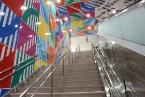
與此同時,車站的兩個巨大的樓梯皆裹上長、寬1218公分的瓷漆金屬板作為裝飾,板上的花樣包括條紋以及條紋間的間隙,寬度和間距皆為87釐米。這個87釐米的尺寸規範了所有的鑲版,並將接合鑲板所需的空間也算進去了。
Meanwhile, two large staircases are clad with decorative panels made of enameled metal sheets measuring 1,218 cm x 1,218 cm. The patterns on these panels include bands and spaces between the strips that have a width of 87 mm. This dimension of 87 mm regulate the position of all panels from the first to the last, taking into account the space required for joints between panels.

在兩座樓梯所處的兩側,一邊採用黑白相間的極簡色調,另一邊則以白色襯上其他八色呈現繽紛感,兩側空間以同樣八種圖形但截然不同的色彩鏡像呈現。這些在牆與天花板上的圖樣在兩座樓梯正中間的軸心處交會,形成一條區隔彩色與黑白空間的分割線,帶給觀者鏡面般平衡又衝擊的視覺效果。
This cladding is deployed on the side walls, on the walls facing the stairs and on the ceilings. The dressing consists of 8 different patterns in black and white, or in white and 8 colors. Each staircase features the mirror-colored patterns, on one of the side walls, the black and white patterns, on the other side wall the colorful one. These motifs fit on the front walls and ceilings to meet the central axis of the staircase that is the break line between color and black and white, forming a virtual mirror.

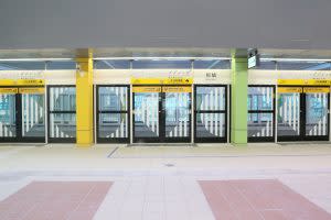
這項公共藝術設計在兩個車站大廳皆使用了兩個元素,第一個就是瓷漆版上的幾何圖樣。印於候車月台門的垂直條紋或是以雕版印刷的方式,或是直接將顏料或白色黏著劑塗於玻璃門上製成。
This project has two elements made on each of the two concourses. First, the motifs on glazed parts. The printing of vertical stripes on the glass parts of the embarkation platform. These vertical bands are made either by engraving on the glass, or by application of paint or white adhesive.
白色的垂直條紋皆為87釐米寬、間距87釐米。這些圖飾被貼在月台與列車間的玻璃門上。第二個元素則是杵立在玻璃門間、光滑漆面的鋼柱上的色彩。這15個彩色的鋼柱並排陳列,共同呈現出彩虹般夢幻的效果。
They are 87 mm wide and spaced 87 mm apart. These patterns are applied to the glass railings of the connecting bridges between the platforms. Second, the coloring of the lacquered steel pillars located between the glazed parts. Each of the 15 pillars boasts a rainbow color.
位於車站下方,支撐Y15車站量體的12個墩柱披上了共96個2.088 x 2.088公尺的釉彩金屬板,每個墩柱以8片裝飾。兩片鑲版合併起來就有4.176公尺高。
96 panels of 2.088 x 2.088 meters enameled metal sheet. Each pillar is dressed with eight panels. On a height of 4,176 meters, the height of 2 panels.
印在鑲板上的八個裝飾圖案在每根墩柱上皆是相同的,每兩個墩柱中就有一個選用黑白色,另一個則以其他八種顏色搭配。最後呈現出六個黑白色墩柱、六個由其他八色配色的墩柱,色彩交錯的幾何圖形為沉重的墩柱創造出新的空間感。墩柱的色彩運用與階梯一致。
The eight motifs inscribed on the panels are identical on each pillar but one pillar out of two is in black and white while the other is colored of the eight colors: six black and white pillars and six pillars in eight colors. The colors are identical to those used for the stairways.
更多 ChinaPost 新聞
海洋元素陶瓷做成台灣最美門牌 就在這個小島 | Matsu Dongyin unveils new, creative door plates
屏東隱藏版絕美教堂 排灣族七彩琉璃珠絢爛吊燈 | Pingtung Catholic church becomes top travel destination
台灣版萬里長城 「報時山」眺望陰陽海絕美景致 | New Taipei Baoshishan Lookout overlooks scenic sea view
